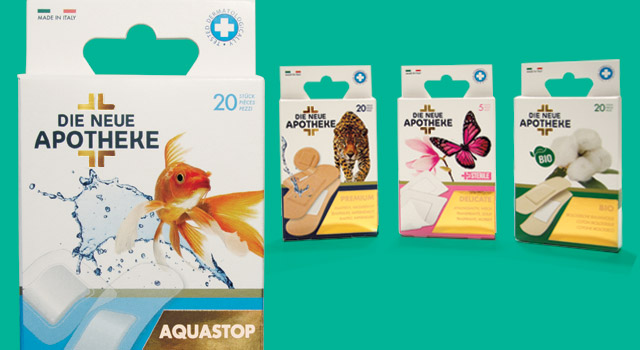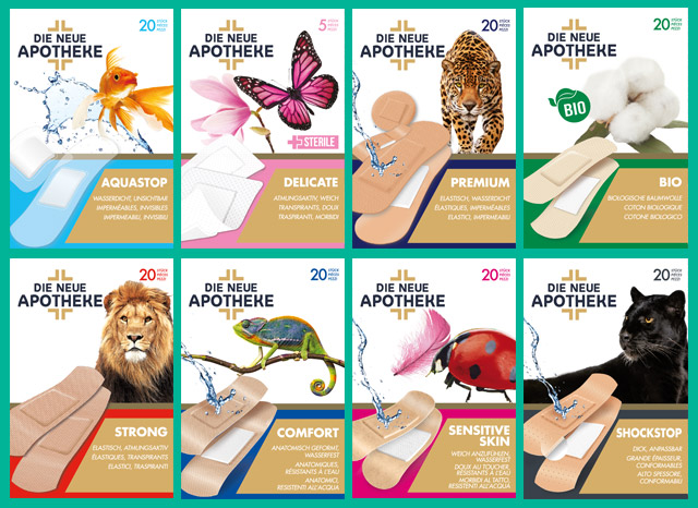
I have talked in several occasions about Pharmaceutical Packaging because the attention required by the development of a packaging addressed to pharmacies and para-pharmacies should be always very high regarding the competitiveness of the sector and the rigidity of its rules.
Today, I share with you a case study developed from zero with my guys in the agency. It is a product thought and developed in Italy, but intended for the German market.
The challenge was not simple; it is actually a typology of product that can be sold both in the pharmaceutical sector and in traditional sectors of the large-scale distribution as well as in retail. In practice, the goal has been beating the competitiveness both in the pharmaceutical sector and in the large-scale distribution where we are not present with our brand, by working on a product like the sticking plaster that it is often perceived as undifferentiated by the consumer.
Selling sticking plasters with Packaging Positioning™ for pharmacies of the German market
I have studied this product with the client for a long time, entering into details to understand the specific properties of sticking plasters. Once I have deepened the topic, I realized that it had particular characteristics. Here it has come my first consideration: if the average consumer (me first) looks at this category of products in an undifferentiated way, it means that something has never been communicated in the right way; here I smelled the first opportunity to take.
5 STEPS TO DEVELOP A PACKAGING POSITIONING™
1) How to use the first real advantage.
The first real advantage in the Packaging Positioning™ of today’s case study is not to be present in the sector of large-scale distribution; this step, for the non-insiders or for less expert marketing offices could be perceived as a disadvantage, thinking of “emasculating” potential sales. In reality, as we are focused in the specialized normal trade sector like the pharmaceutical and para-pharmaceutical one, it becomes an advantage because we can position our product (perceived as indifferent) in a different way, something that in the large-scale distribution would be almost impossible.
2) Place emphasis on specific characteristics that no one communicated
I am talking about the German market; however, this has never exonerated me from assessing the competitors on the market; it hasn’t been as easy as going to the pharmacy under the agency and purchase all sticking plasters in commerce, but we did it with the same precision. Once this research was over, we perfectly knew what we did not have to do.
3) How to develop the product lines.
My third consideration has been to identify and highlight the characteristics and modalities of use of different sticking plasters so that we can work with a variety of references that could, at the same time:
– emphasise the single characteristic (specific products)
– transmit the strength of the brand with a coordinated corporate
In this way, we could have entered the market with a new brand that offered different product references (sticking plasters) that could meet specific needs (different references).
Do you need a pharmaceutical packaging for the foreign market) CLICK HERE →
4) Transfer of feelings
The fourth step is the transfer of feelings, a very important step to communicate with the consumer without using verbal communication; for this purpose, we have carefully studied the way to use it in our favour also in this occasion. The idea has been simple: associate to every typology of sticking platers a visual capable of evoking the differentiating characteristic of the sticking plaster in the single reference.
The power of the universal language of nature helped us by supplying a solution that guaranteed us the maximum level of comprehension.
5) Working on the perception of the subject
When we have developed the fifth step, we have used the experience that has helped us working on the market of packaging for twenty years. We knew that not only the visual, text or graphics communicate on the packaging, but there is an aspect that many participants underestimate: the print with particular cards or with techniques subsequent to the standard print so that people can perceive the product as premium. In this case, we have used the gold leaf in the logo and opaque and shiny varnishes on the front part of the packaging.

Development assortment of references (peculiarities of the product)
In this way, we have associated to the 8 typologies of sticking platers, 8 images that characterize the single reference.
Therefore, the visual of a lion has been associated to the reference of reinforced sticking platers ideated to resist more, a fish to the waterproof ones and a cotton flower to those made of organic cotton.
WARNING: do not confuse the choice of using a visual that exploits the image of some animals as a creative expedient because it’s NOT like that!
This choice, like the other ones taken for the development of the Packaging Positioning™ of this product, is based on analytic decisions. Specifically, to the logic question “how is it possible to evoke the concept of resistance, lightness, organic, etc.?”, we have simply looked for an answer that could work; in this case, the value we universally give to these images was perfect, capable of going beyond every linguistic barrier.

Naming
In this case, we found it already registered in the reference market by our client, but how can we find a naming for the German pharmaceutical market? It is true, it is not easy, but the principles of the research of a naming are universal; therefore, before saying “okay to naming” or “Good first take”, we have analysed what competitors communicated, to identify what we can better communicate and in an univocal way.
Die Neue Apotheke that literally means “the new pharmacy”, immediately attributes a precise affinity to the sticking plasters line (a product intended for pharmacy), using a very powerful feature especially in this field: originality. The “new” in the pharmaceutical field is synonym of research, of latest discovery, of improvement compared to products sold in the past. For this reason, it communicates at different levels a benefit to which the consumer is very sensitive.
Case
The structure of the cardboard case in its simplicity has been thought for a double exposition (it can be hanged in dedicated areas of exposition or placed in a shelf), today the hanging packaging is growing and it is a reference point for the future without any doubt. (watch the video)
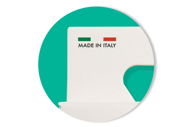
As far as packaging is concerned, we opted for the choice of communicating the origin of the product with the writing “Made in Italy” and the tricolour, a predominant space dedicated to the visual and a golden area that could highlight the characteristics of the single reference.
These are all elements which have been carefully combined to increase the perceived value of the product and placing it clearly in a higher price range.

Conclusions
The Packaging Positioning™ of the sticking plasters line called Die Neue Apotheke asked us some more effort: comparing ourselves with a foreign market where the touch of the “Made in Italy” design and the experience of an agency that could use all its experience to take a niche opportunity in a foreign market with a work of research and development focused on the sole packaging was needed.
This aspect didn’t request us artistic flair or creativity, but a precise methodology of analysis to identify what that market was asking in that moment.
→ If you have a non-differentiating product but 100% “Made in Italy” and you wish to understand how to increase your turnover by taking advantage of the opportunities of the foreign market thanks to packaging, contact us.
The Packaging Positioning is this: a focused answer to specific needs that through the packaging of the product gets attention and confidence by the consumer.
This is exactly what we did with the Die Neue Apotheke sticking plasters.
What can you do to improve the packaging of your products?
This is the most frequent question that businessmen and marketing directors ask me. If this is what you are asking to yourself, contact us without commitment; we will be glad to analyse your situation and offer to you a dedicated solution.
In 1996 enters in the world of marketing, in 1999 founded Ardigia Marketing Funzionale (Ardigia Functional Marketing), in 2013 founded Packaging in Italy, Design Agency for Packaging Positioning™


