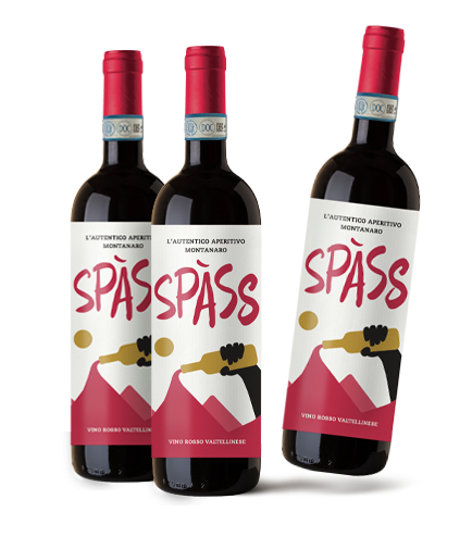
The Spass project was born after a long reflection about the positioning of a wine.
We identified that we could positioned a wine completely contrary to normal.
While everybody competes to position their wines at the top as refined, aged and elaborate, we decided to make a less elite brand, more party-oriented and basic.
For short, a wine to drink, like true highlander. From here it comes Spass, the authentic mountain aperitif. Just red wine as an aperitif.
We had the idea, but the big challenge to overcome was to make a label which supported and strengthened the positioning.
After reaching out different graphic designers and agencies we were literally desperate. We didn’t even have a “sufficient” idea in our hands.
We came across Packaging in Italy almost by chance and reading their materials. It seemed exactly the reality we were looking for.
The results were not long in coming: after the consulting with Michele, where we focused our needs and the strategy, they moved on to operational.
We approved the first draft directly and we are really excited about the result.


