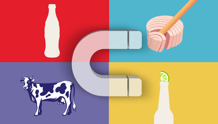
With Visual Hammer we mean a visual, that is on the packaging and not only, which identifies a product or a brand which is a clear idea in the mind of the customers: in this way an unequivocal link is created to become indispensable for its recognizability.
Practically that simple image becomes a synonymous of the product itself strengthening its presence in our imaginary. A visual element which fixes and focuses, with strength, in the mind of everybody a certain brand or product which is instinctively and immediately recalled in the mind of the audience.
Most of the time it comes from on the packaging, but in many cases it is used and conveyed, thanks to its strength, in commercial and advertising campaigns.
One of the most common examples of Visual Hammer is the one of Coca Cola. This brand has got a lot of historicity and it is so strong that really it hasn’t got just “one”, but “three” Visual Hammers.
What I am going to show you is the proof that comes up to your mind with just one image:
In a nutshell they are:
1) The silhouette of the bottle
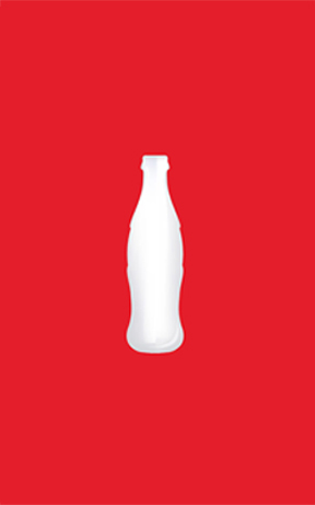
2) The white wave on red background

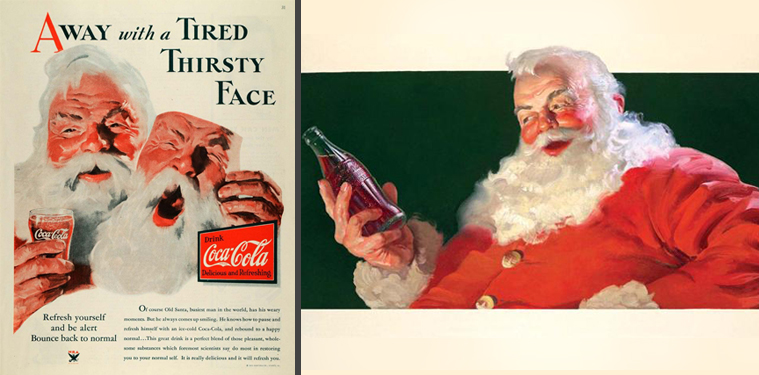
3) Santa Claus illustrated
The Visual Hammer, also, is paramount to reinforce the naming and the positioning of the product. A good Visual Hammer, in fact, helps non just to remember the brand but also its positioning.
Do you want to create a Visual Hammer for your product? Contact us!
When you think about Milka what comes to your mind?
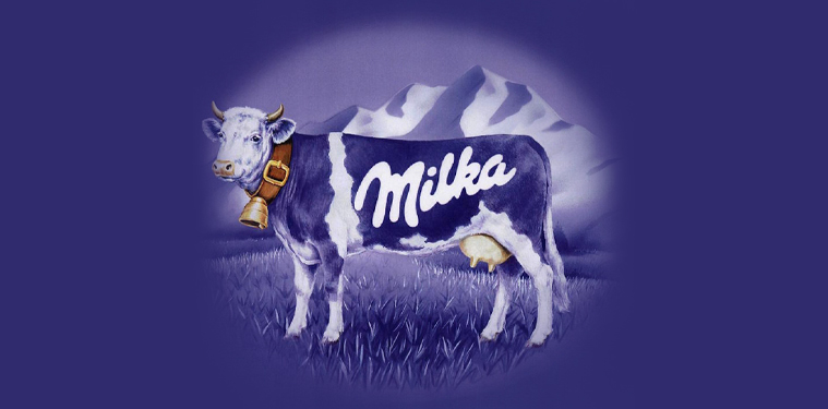
Definitely the image that has just come to your mind is the one of the “Purple Cow” that with this Visual Hammer leverages on the Brand Positioning of Milka:
The milk chocolate of the mountains. The healthy one, of the Purple Cow”.
This is exactly the difference between the Logo and the Visual Hammer. The Visual is not directly part of the Logo, but in some circumstances it is an effective addition to the Logo. The Visual Hammer is used with the goal to improve the recognizability of the Brand, and in some cases could be stronger than the Logo itself.
I am going to show you a couple of examples of Visual Hammer to Logo:
Corona Beer logo vs Lemon on the neck of the bottle
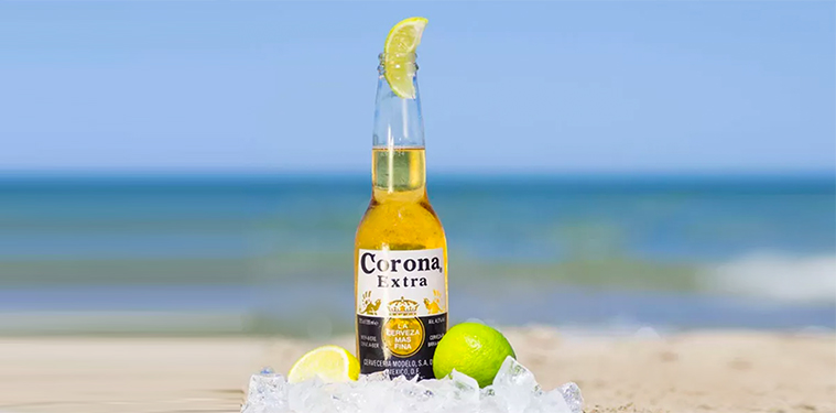
The Logo of Corona Beer almost gets lost, it hasn’t got memory and strength in the mind of the customer. It is likely that to the question “Explain me how the logo of Corona is made”, many people wouldn’t be able to answer you, and others would tell you that there is the lemon.
Logo Michelin Vs Man
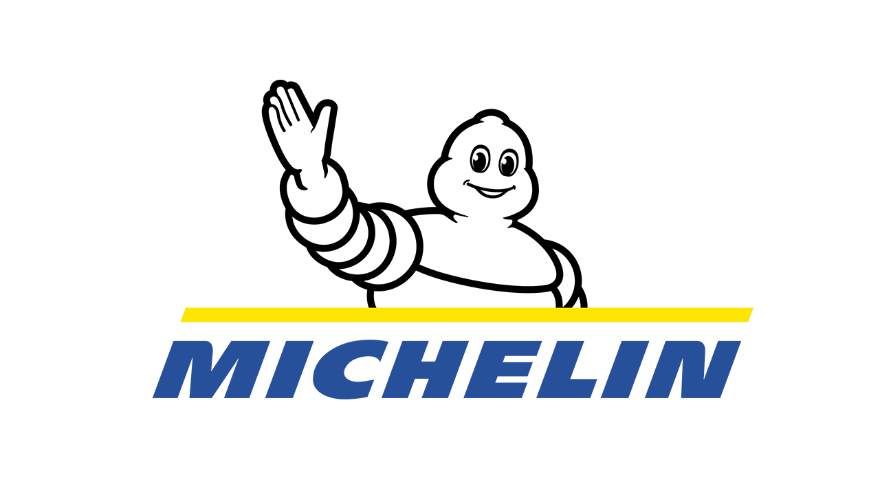
This example is clear to explain how the Visual Hammer of the Michelin Man is strong. This visual is called “Bibendum” and it was so strong that the Michelin had tried to remove it from the logo but it was forced to insert it again.
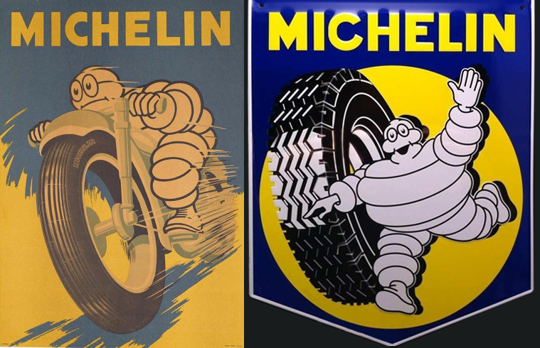
The development of the Visual Hammer can be very important, if not fundamental, to the sales and the customers.
Not making, in fact, a strong visual for a company could be penalizing. Once you have made this Visual Hammer you should exploit it on the front of the packaging.
The visual key should be always contemplated in the development of a new project. In the phase of the development of the Logo, you should consider which visual key element could be used combined to it.
You should pay attention to the following aspects:
- The visual key should be easy and understandable
- It should be unique and unmistakable
- It should be used on different media
- It should faced the feelings of the target group
The head for the Trout & Partners and for the Packaging Positioning®.
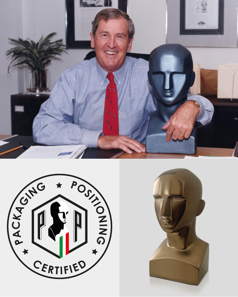
The Visual Hammer is fundamental to win the war on shelves
In the current world everybody is bombarded of communication and advertisement. Whenever, wherever we are. The human mind thinks in a simple way, and it needs simplicity. The products have just few seconds to catch the customer’s look to convince them to the purchase. For this reason the best way to get in the customer’s mind is trying to stay there for a long time and this is exactly the reason to develop and exploit a Visual Hammer.
The brands that have a Visual Hammer on their Packaging Positioning® are often the leaders in their categories.
The value of the Visual Hammer is strong both for the marketing and the branding of the product.
Its role is, in fact, necessary: it communicates and acts without using any words, catching the attention of the consumer who recognizes in those images a certainty. If it disappeared from the packaging it would lose its magic.
For this reason developing a packaging which includes a Visual Hammer is a long term guarantee for the success of your product. It represents a certainty for the future because it is able to exploit a real secret weapon that will not evaluated by the customer in a rational way, but it will act in their subconscious
If you want to understand if also your company or product has already or could have a Visual Key and if you are curious to understand if these marketing operations are able to bring tangible benefits to the sales, contact us for a free consultancy.
How much does the restyling of your old packaging cost?
Are you a Start up and you need a quote?
Do you need a Corporate Identity and you want to know the price?
Do you want to know how much a single packaging cost?
In 1996 enters in the world of marketing, in 1999 founded Ardigia Marketing Funzionale (Ardigia Functional Marketing), in 2013 founded Packaging in Italy, Design Agency for Packaging Positioning™


