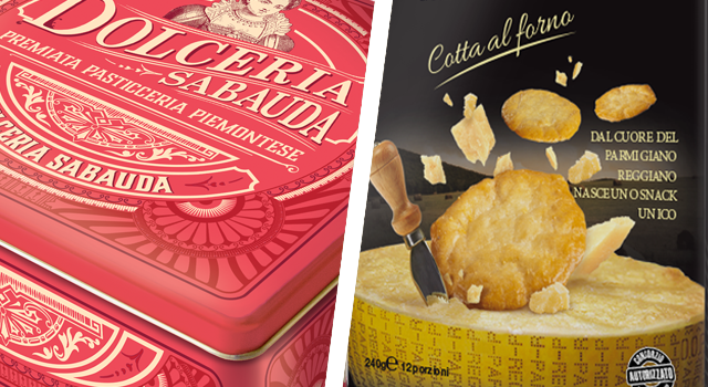
Today, I want to talk to you about two case studies developed in our agency.
I will show you two historic products, which have followed an opposite strategic marketing development. In both cases, the result obtained will be a product’s positioning that is capable of increasing sales.
I am talking about the Parmigiano Reggiano and the soft Amaretto biscuit, two products which were born in the 8th century, which have been always commercialized in the same way on the market.
We know that the distinctive characteristics of a product are an essential element for its success.
As I explain in the eBook dedicated to the Genetic Profit™ (download it for free here), a packaging capable of selling forever requires products with strong distinctive characteristics.
The Paré Product: increasing sales thanks to the restyling of packaging.
Parè (a product that is already present on the market) asks us to reposition its packaging in function of its characteristics and reference market. Sometimes the characteristics of the product already exist, in some other cases we start from a poor starting point, but there are rare cases of products that arrive on the market as an absolute latest product.
When it seems that everything has been already said, like with the Parmigiano Reggiano, innovative companies are able to create a new product and they often do it starting from a simple idea.
This is the case of Corniano Srl, a company in the province of Reggio Emilia, which has launched a brand-new product on the market that derives from the product and name Parmigiano Reggiano.
Technically, it is a snack cooked in the oven”, made of a crunchy puff of Parmigiano Reggiano.
Our intervention of restyling was founded mainly on 3 points:
- Payoff
- Visual
- Dedicated exhibitor
PAYOFF
As it was a new product, but with an existing graphics, the need to make the consumer soon and clearly aware of what the product was, it was even more important for its commercial success.
For this reason, the payoff has passed from the old “An excellence for you” to the new “Parmigiano Reggiano Puff”, using a clear message to position the snack.
VISUAL
The visual on the old packaging was not capable of communicating and emphasizing the product and its raw material adequately; our intervention consisted in creating a visual that could make immediately evident the connection with the Parmigiano Reggiano, giving space to the product itself too (the crunchy puff).
ESPOSITORE
As it is a product sold as snack in bars and in front of the registers in supermarkets, a dedicated exhibitor that could show the same visual of the single packaging was essential to remark upon the raw material (widely known by consumers) and the characteristics of the snack.
As you see, only few focused interventions have been sufficient to let a product with a great potential explain its own difference in a suitable way.
It has been a surgical work. By keeping the final goal in mind (increase sales), it has worked on the payoff giving a clearer shape to the verbal message “Parmigiano Reggiano Puff” and to the visual, making maximum use of the non-verbal message of the packaging and the exhibitor.
When do a naming and a packaging change your sales?
Answer: In this second case study.
Our work was directed straight to the development of a packaging that could reposition the brand, that is to say the “Brand Positiong”. It is not about innovation of the product, it is the repositioning of a pastry shop of Castelletto d’Orbia (a countryside in the province of Alessandria), of Piedmont origins; it is a family of pastry chefs passed down from many generations and producers of the famous Amaretto di Gavi and all typical recipes of the Royal family of Savoy, bakery products like the Lady’s Kisses dry biscuits. For this reason, the main instruments on which we have worked were naming and packaging.
The evolution of a naming
The first step develops with the evolution of the naming, the brand ”I Dolci del Moro” becomes for us ”Pasticceria Sabauda” (Savoy Pastry-making); here comes the idea of the development of a logo and a visual that call back to the Royal family.
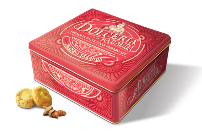
As second step, we have identified a generic gift box. Then, we have chosen an institutional Tin Box, with a graphics that could refer to the positioning of a new brand and a subsequent closure personalized by a label that could identify the single reference.
Motivation of the two choices:
- We chose the Tin Box to position a luxury product, with more marginality on a very competitive internal product. Moreover, the gift box gives a second life to the packaging with a rebranding of the new logo.
- A generic packaging, personalized with an adhesive of the single reference that is also used as a closure of the Tin Box itself. This process has been done to amortise the costs for a SME during its start-up process. One packaging for more products, always differentiated by the single label: the ideal solution!
In both cases, the increase of sales has been concrete, even if we are in front of different strategies and choices. Anyway, these are the ideas that a businessman should have to be always cause-effect in his market sector.
Conditioning the market thanks to your own choices (of packaging, in this case) and not being subject to it is possible, as we have seen with these two case studies.
I leave space to the testimony of Paolo Cazzulo, the owner of the new brand Dolceria Sabauda.
This is also to bear witness that, even when people think that innovation is offside and the product has already done whatever it could do, there could be big chances to take behind the corner. Ask for a dedicated consultancy for your products because what we do day by day is not limited to the Parmigiano Reggiano or to the Amaretti di Gravi, but it suits the packaging of every product. This is the science of the packaging headed towards sales.
Find out how we can help your products too with a restyling of the packaging headed towards the increase of sales. Contact us.
In 1996 enters in the world of marketing, in 1999 founded Ardigia Marketing Funzionale (Ardigia Functional Marketing), in 2013 founded Packaging in Italy, Design Agency for Packaging Positioning™


