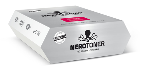
I addressed to Packaging in Italy because, compared to others, are not only creative people but they base their work on the brand positioning.
We were not interested in having a mere “nice box” and a “nice” logo to see, but an all in one that was based on something concrete, which is actually the difference in comparison with our competitors and the easy recognition by the clients.
I am very satisfied of the work they have done and the result obtained, both with the logo and the packaging.
NeroToner™ Più Stampe, Più Nero, is now a complete and unique product in the sector of ink-cartridges for printers, easily recognisable, with a very pleasing impact packaging to the eye.
Special care has been given to the study of the visual hammer, which contains the essence and uniqueness of our product in one image, which is specific for monochrome printers.
Thanks to Packaging in Italy for the professionality shown and for having realised our new brand.


